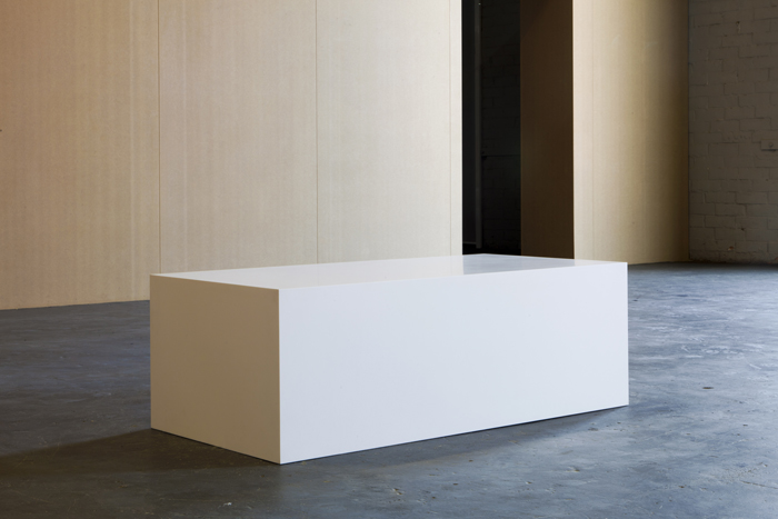
Steve Van den Bosch, Someone you’ve never seen before, 2011. Corian, multiplex, metal, plastic, 140×70×47,5 cm.
Installation view of Elements for a Retrospective, a group exhibition at Extra City Kunsthal, Antwerp, 2012. Photography: Ben Van den Berghe
1/3
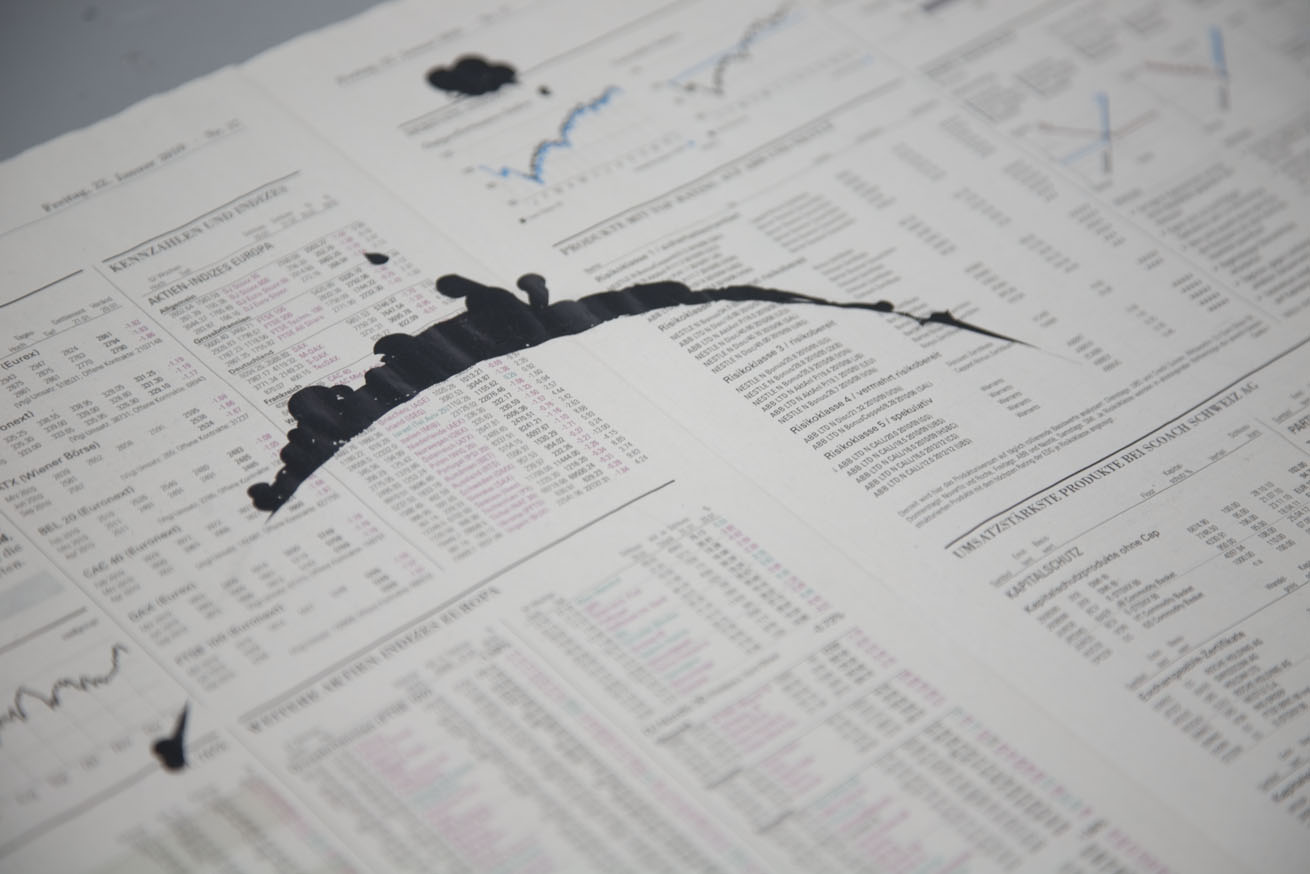
Unter Druck (detail), 2010. Letraset Correction Symbols on the stock market pages of the Neue Zürcher Zeitung, 46,5×63,8 cm. Photography: Eric Sapin
2/3
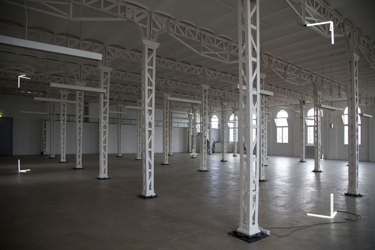
Steve Van den Bosch, , 2009. Neon, variable positions, (8 ×) 50×50×50 cm. Installation view of Untilted, Artis, ‘s Hertogenbosch, The Netherlands. Photography: Annaïk Lou Pitteloud
3/3
Someone you’ve never seen before introduceert een milde paranoia die een moment van fictie in het vooruitzicht stelt. Er speelt een verlangen naar het eeuwig nieuwe beeld. Met deze versie van het werk, dat in drie verschillende uitvoeringen bestaat, wordt de toeschouwer, die plaatsneemt op de bank in afwachting van een onbekende, zelf tentoongesteld en dus op zijn of haar beurt de onbekende waar de titel naar verwijst. In Unter druck werden met ouderwetse wrijfletters — in dit geval correctiesymbolen: balken, ovalen, cirkels — fictieve verfsporen, zoals die vaak rond verfpotten ontstaan, minutieus geconstrueerd op de opengevouwen beurskatern van een krant uit een van de duurste steden ter wereld. Vanop een zekere afstand lijkt de pagina niet meer te zijn dan het soort papier dat een ateliervloer beschermt en geen waarde heeft, behalve dan als verwijzing naar een schilderij dat zich elders bevindt en dus enkel onderwerp van speculatie is, zowel intellectueel als financieel. Dichterbij worden de geometrische details echter scherper en verraadt het werk zich als een vervalsing. Een erg nauwkeurige en arbeidsintensieve vervalsing van een waardeloos nevenresultaat van de artistieke praktijk, een object waarvan de status voortdurend wankel blijft. In het laatste werk vormen acht neonhoeken een leeg volume in de tentoonstellingsruimte. De verhoudingen van het volume zijn afhankelijk van de verhoudingen van de tentoonstellingsruimte.
De titel, , bestaat uit acht ontbrekende lettertekens — de letters van het woord Untitled — en creëert op die manier gaten in elke tekst die de titel vermeldt. Gaten die continuaties zijn van het lege volume in de tentoonstellingsruimte.
Someone you’ve never seen before introduces a mild paranoia that sets up the prospect of a moment of fiction. At play is the desire for the eternally new image. With this version of the work, which exists in three different guises, the viewer who sits down on the bench in expectation of a stranger, are themselves put on display, and therefore the very stranger to which the title refers. In Unter Druck, 2010, with old-fashioned transfer letters — in this case correction symbols: beams, ovals, circles — fictive traces of paint were painstakingly constructed on the open stock market pages of a newspaper of one of the most expensive cities in the world. From a certain distance the page doesn’t seem to be more than the kind of paper that protects a studio floor and is of no value, except as a reference to the painting that is elsewhere and is merely the subject of speculation, both intellectually and financially. Up close, the geometrical details however come into sharper view and the work reveals itself as a forgery. It is a very meticulous and labour intensive forgery of a worthless derivative effect of the artistic process, an object of which the status remains forever unstable. In the final work, eight neon brackets demarcate an empty volume in the exhibition space. The proportions of the volume are dependent on those of the exhibition space. The title, , consists of eight absent letter signs — the letters that make up the word Untitled — and thus creates gaps in any text that mentions the title. These gaps are continuations of the empty volume in the exhibition space.
Someone you’ve never seen before instaure une légère paranoïa qui ouvre la perspective d’un moment de fiction. S’y mêle un désir d’image éternellement nouvelle. Dans cette version de l’œuvre (il en existe trois), le spectateur qui prend place sur le banc, dans l’attente d’un inconnu, est lui-même exposé, et il devient donc à son tour l’inconnu auquel le tître fait référence. Dans Unter Druck, 2010, de vieilles décalcomanies — en l’occurrence des signes de correction: rectangles, ovales, cercles —, des traces de peinture fictives, comme celles que l’on trouve souvent autour des pots de peinture, ont été minutieusement appliquées sur le cahier financier ouvert d’un journal d’une des villes les plus chères du monde. À distance, la page ressemble au genre de papier qui protège le sol d’un atelier et qui n’a aucune valeur, si ce n’est en tant que référence à un tableau qui se trouve ailleurs et n’est qu’objet de spéculation, intellectuellement et financièrement. De plus près, les détails géométriques deviennent cependant plus nets et l’œuvre se révèle être un faux. Un faux – réalisé avec une grande précision et ayant nécessité beaucoup d’heures de travail – d’un résultat accessoire sans valeur de la pratique artistique, un objet dont le statut demeure constamment bancal. Dans la troisième œuvre, huit néons d’angle délimitent un volume vide dans l’espace d’exposition. Les proportions du volume dépendent des proportions de l’espace d’exposition. Le titre, , se compose de huit caractères typographiques manquants — les lettres du mot Untitled — et crée ainsi des trous dans chaque texte qui mentionne le titre. Des trous qui sont des continuations du volume vide dans l’espace d’exposition.